 It's amazing what I find while cleaning out old files. I guess I should be pleased that I've seldom thrown anything away during my career. There, stuck in a totally unrelated file folder, was a piece of paper with couple of phone messages from sometime in 1986 when I was sharing office space with City Guide Magazine, the Seattle Men's Chorus, the Alice B. Theatre company and the Pride Foundation. The yellow paper has even more yellowed scotch tape on it and a thumb tack hole where I probably stuck it on a bulletin board at some point. The messages said "Jeff Hest called - will be at the Ritz @ 5 pm" and "Ken D. called." Jeff was one of my best buddies when I lived in Seattle, the Ritz Cafe (long since closed) was one of our favorite bars, and Ken D. (Decker - now long deceased) was a great friend and client.
The phone messages were not why I've saved the scrap of paper for about 20 years. Also on the paper were the doodles of what were to become a logo and T-shirt design.
The late 80's found the U.S. dealing with the ever-growing AIDS crisis. At the time I was doing design work for a number of AIDS and health organizations in both Seattle and Portland. Part of my work involved getting safe-sex messages across to the general public. I'd been kicking around the idea of a graphic proclaiming "A Rubber's Ducky" - or, in other words, "a condom is a good thing" - for some time. Obviously, that idea manifested itself in the sketches on a message pad.
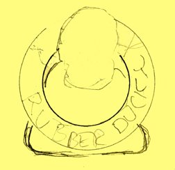
 The original concept was for the traditional rubber ducky we played with as a kid to have its head sticking out of a nautical life preserver. The text "Rubber Ducky" appears in the first very rough sketch. The beginnings of what were to be the duck image, with a hint of rope, appear in the second rough.
As the design was fine-tuned, the life preserver took on the more realistic look of those on a friend's boat. The duck somehow developed the reservoir tip of a condom on the top of its head and - in the stencil type often seen on sea-going vessels - the text became "A Rubber's Ducky." The result is still one of my personal favorites in the vast collection of identities I've designed. In part, I'm sure due to the cute and clever incorporation of the serious safe-sex message. A few T-shirts were produced for friends back then. Mine has long since worn out. Perhaps it's time to produce a new batch for the current generation that might benefit from the message.
 The image has kind of taken on an international life of its own. It appears in the Japanese book New Logo & Trademark Design (republished in paperback as Logo and Trademark Collection), the first book in the LogoLounge series and in the recent Spanish volume Logos from North to South America. It also was recognized with LOGO 2001 honors and, as a result was published in the book The Big Book of Logos.
The process of going through 30 years of design files is tedious and somewhat exciting. I'm cataloging and archiving all examples of my work - and certainly not throwing anything away. I'll be sharing more past projects in the future.
(This entry originally appeared on bLog-oMotives on August 5, 2006.)
© 2007 Jeff Fisher LogoMotives