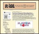
As mentioned in a previous "excavated artifact" entry, I once shared office space in Seattle with the performing arts organization. Back in 1987, one of the first projects I executed for the Chorus was an identity.

In my old project files I found a number of black felt pen concepts, sketched on sheets of typing paper, for what would become the Seattle Men's Chorus logo. My first doodle included a little black bow tie as a design element over the "M" in a "SMC" representation. As is the case in about 80-85% of my logo design projects, this initial "brain fart" would remain a constant throughout much of the logo creation process and end up playing a major role in the final image.
Some other rough concepts (above) included an image of a man in a tuxedo (which I would incorporate into a future season ticket brochure design for the SMC), a bolder treatment of the SMC/bow tie idea, and a silhouette of a conductor using the Space Needle as a baton. Additional ideas (below) included more Space Needle imagery, an elegant intertwined monogram image, a clef note flipped to represent the "S" letterform, and an emerald-shaped border (a reference to Seattle's "Emerald City" nickname and the gay community's attachment to the film The Wizard of Oz).

With an office staff, good-sized Board of Directors and large membership of singers, this project could have become a "design by committee" nightmare. However, I worked one-on-one with the SMC marketing director, who seemed to steer the project effortlessly through the process by submitting a very limited number of concepts to decision-makers. In my files I found his own feedback in the form of a doodle suggesting that my heavy "SMC" image, with the bow tie, be incorporated within an emerald shaped border. The result, hand-drawn in the pre-computer time - with spray glued typesetting dropped into place, was finalized as the logo for the Seattle Men's Chorus (below).

The identity was very successful in one color (sometimes black; sometimes emerald green), as a metallic foil image, foil-stamped in gold on some items and in a variety of treatments on wearables. It served the Seattle Men's Chorus well until the organization was rebranded by the Phinney/Bischoff Design House in 2005 - nearly two decades later.
My association with SMC continued through the early 1990's; even after I had moved back to Portland. During that time I designed several season ticket brochures, designed and produced numerous event programs, created print ads and invitations, did design work for the international GALA Choruses Festival when held in Seattle, and much more.

I also created a number of additional identities for SMC (above). A logo was produced to represent the major donors' organization, the Seattle Men's Chorus Director's Circle. I designed the initial SMC donor publication, Chorus Quarterly, and its identity. As SMC moved into publishing of programs for other performing arts organizations, I adapted the organization logo to brand its new Emerald City Arts department. My favorite has always been the identity for Philandros, a sub-group of the Seattle Men's Chorus.
I always look back on my work with SMC fondly. It was an incredible opportunity to work with a dynamic arts organization and all the wonderful people involved.
(This post originally appeared on bLog-oMotives.)
© 2008 Jeff Fisher LogoMotives